

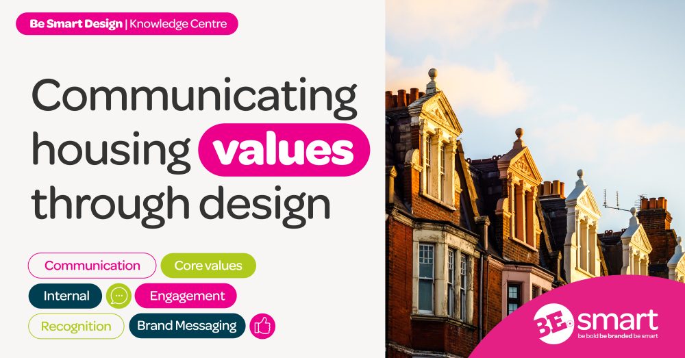
As a housing association, your core values shouldn’t just be some lofty ideas printed on a wall or tucked away in a report never to see the light of day. They’re the heartbeat of your work. They should guide how you serve your tenants, how you interact with regulators, and how your staff carries out day-to-day tasks. The thing with values is that whilst words are all well and good, your values need to be felt. And one of the most effective ways to make that happen? Design.
Good design isn’t just about making things look lovely, it’s about making sure your values are clear, consistent, and, most importantly, meaningful. Whether you’re communicating with tenants, regulators, or your own staff, design can help those values leap to life. So, how can you make sure your HA’s values are coming through in everything you create? Keep reading, we’re going to tell you!
Identifying your core values and audiences
Before you even think about design, you need to know and be clear on who the heck you’re designing for. As a HA, you’ve got a few different groups to consider: tenants, regulators, and internal staff. While your values stay the same, the way you communicate them will need to be tweaked for each audience.
Tenants
These are the folks you’re here to serve, so your design needs to be clear, friendly, and approachable. If your values centre around things like support, reliability, and trust, your design should make tenants feel comfortable and empowered. For example, if a tenant needs to report a maintenance issue, they shouldn’t have to hunt for a contact number or navigate through a confusing website. Your design should make it easy for them to take action, whether that’s finding contact info or understanding the next steps in resolving their issue.
Regulators
Regulators are all about legislation, accountability, and compliance. Your design for this audience doesn’t need to be flashy, but it should reflect your values of integrity and responsibility. Think about clean, straightforward layouts, clear fonts, and easy-to-navigate reports – after all, no one likes struggling to make head nor tail of a report! When regulators see your materials, they should instantly recognise that your organisation is well-run, reliable, and serious about meeting standards.
Internal staff
Your team needs to live and breathe your values every day. Your design for internal communications should encourage and nurture a positive, collaborative environment. Whether it’s internal presentations, training materials, intranet or onboarding materials, make sure your design promotes a sense of teamwork, transparency, and support. For example, use a design that encourages open communication or showcases success stories where staff members have gone above and beyond to help tenants.
Design can encourage open communication, highlight success stories where staff have gone above and beyond for tenants, and promote a culture of teamwork and transparency. This is where we at BeSmart can really help, ensuring that everything from your onboarding to internal comms not only looks great but consistently reinforces your brand values!
The importance of consistency in design
Okay, now we’ve ticked off the audience box and you know exactly who you’re targeting, it’s time to think about consistency. A consistent design doesn’t just look good, it makes sure your values come through clearly across every platform and touchpoint. Whether it’s a social media post, a printed flyer, or a staff presentation, your design should always send the same message.
Why does consistency matter so much? Well, when someone interacts with your organisation, they should immediately recognise it. If your website has one look, your printed materials have another, and your social media pages feel completely different, it creates confusion and can even build mistrust. Think about one of your favourite brands for a second; we bet you can picture exactly what their colours and designs look like. That’s why having a consistent visual identity — think logo, colour scheme, even typography — helps reinforce your brand’s message.
For example, if reliability is a core value, your design choice could reflect that by being clean, organised, and easy to navigate. People shouldn’t be frustrated trying to find basic information on your site or in your communications. Clear, consistent design builds trust and reassures people that you’re dependable and serious about your mission. And don’t forget about internal materials. Your staff needs to see the same level of consistency in their communications, too.
Using modular design for effective communication
One of the very best ways to make your values clear and easy to understand is through modular design. Modular design is all about breaking things down into bite-sized, easy-to-digest pieces. It’s a great way to communicate your values in a way that’s both flexible and scalable.
For example, you could create a series of modular posters or digital graphics that explain each of your core values. Each one could highlight a specific value, what it means, and how it translates into action. These modules can be swapped out depending on what you need to communicate at any given time, without disrupting the overall design of your materials. This makes it easier for your audience to absorb and understand your message, no matter where they encounter it.
Modular design can also help make your communication more adaptable. Maybe one day you need to focus on community support, and the next you need to talk about environmental responsibility. With modular design, you can easily highlight different values without having to reinvent the wheel every time – pretty darn nifty, right?
Need some help with your company’s branding and design? You’re in the right place! Contact our friendly team today, we’d love to help.


